


At Pantone Color Institute, we unite the science and emotion of color
Recognized globally as a leading source of color expertise, Pantone Color Institute provides color insights and solutions; collaborating with our clients to strategically address color challenges and develop a color and design approach consistent with their brand vision.
Pantone Color Institute can guide you through the development of a color strategy that fits your company’s unique needs in the following and more:
- Color trend forecasting
- Brand color development
- Custom color solutions
- Product palette selection

Brand color accuracy and achievability
Brands use color to make an immediate connection and a consistently maintained brand color can become iconic. Custom Color standards are the tools that ensure accurate communication of a color to achieve that consistency.
We work with brands requiring a more accurate definition of their current color, or who are undertaking a comprehensive rebrand and shift in their color, and with digital brands whose colors do not translate well to the physical world of printed, coated or dyed materials.
Tying color psychology messaging to brand values
Each color produces a physiological response and conveys its own psychological message and meaning.
Combining decades of ongoing consumer color preference study research with our knowledge of upcoming color trends, we help our clients leverage the power of color by creating tailored color messaging that will support color selection, generate exposure through marketing/social media and PR campaigns, increase brand or product visibility and produce greater consumer engagement.
Business of color, trends, brand visual identity
Pantone Color Institute creates innovative and informational presentations or workshops focusing on the business of color – including color trends, color strategies, global color influences and the importance of color for brand visual identity.
Presentations and workshops can be tailored or personalized to meet audience need and interest level.
Defining the right brand color
At every level of the marketplace, color establishes a brand image, instantly broadcasting the goal and vision of the brand or company it represents. The brand equity built around the thoughtful use of color has a singular ability to differentiate brand visual identity and immediately influence consumer engagement.
We can help select, define and refine your brand’s signature shade, to create something timeless and specially tailored to your brand or product.
Color direction for product, packaging, marketing/PR campaigns and web design
Our clients come to us for trusted thought leadership and color insights. We collaborate with our clients to create innovative, customized color ranges tailored to defined requirements and in line with brand vision; working closely to select colors or enhance existing core shades whose appeal will resonate with their target audience.
We highlight color selections with aesthetically provocative and culturally relevant imagery, creating a visceral color story supported by color psychology key words and unique color names.
Services include:
• Color trend direction up to 5 years ahead
• Color palette recommendations for brand and products
• Brand color stories
• Unique color naming, messaging, and meanings
• Color palette validation
Custom color solutions
The Pantone Color Institute empowers brand owners – and all those in their supply chains – to ensure the integrity of their brand and product colors through a range of custom solutions in the language of PANTONE.
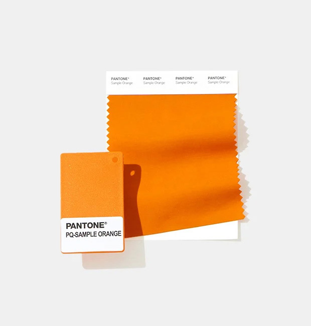
Our physical Custom Color solutions can be combined with the data that you need to properly communicate the color. We can supply RGB, HTML, CIE L*a*b* or process-specific CMYK. Our customers work with color in many ways. We ensure that they get the data they need for the job at hand.
We offer a collection of custom color solutions to match your needs:
Custom printed
The master standard for global brands
Standard size: 8½" x 11"
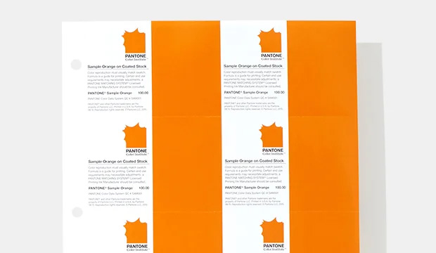
Our off-the shelf solid color standards have defined Pantone for decades. For just as long, our custom-printed solutions have served as the master standards for global brands wishing to define and standardize their colors.
We offer both custom formulations to support uniquely defined brand colors and custom printed standards to support brands that define their colors using our PANTONE MATCHING SYSTEM™ and Fashion, Home + Interiors palettes.
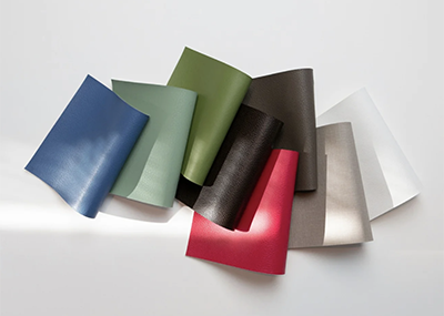
Custom textiles
Develop that perfect color for any textile application
Standard size: 4" x 4", unfolds to 4" x 8"
Our custom textile colors developed on cotton fabric will perfectly match your inspiration, allowing you to realize your color all the way through production. Custom color swatches can be fully branded and are available in a 4" x 4" double-layered swatch card, along with spectral data and dye formulations.
Custom plastics
Create product look and feel
Standard size: 3" x 1-7/8"
Constant development work in the field of plastics creates a moving target for accurate color realization across product lines. Our custom color plastic standards can be delivered in custom resins to closely match the look and feel intended for a product.
Coated standards solutions
Using the worldwide Munsell Color system, Pantone Color Institute offers solutions for any industry where color-based assessment is required.
The Pantone Color Institute works within a diverse range of industries including fashion, home, contract design, paint, beauty, automotive, sports, pharmaceuticals and more.
Color control panels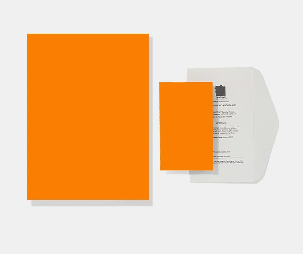
Standard size: 3" x 5"
For precise color communication, specification and visual or instrument-based assessment through your supply chain. Supports a broad range of appearances including opaque, translucent, transparent, florescent, textured, pearlescents and metallics. Also available in more durable washable formats suitable for food applications. Includes Munsell System Notation and packaged in customer branded light-proof envelopes.
Quick color standards
Standard size: 8½" x 11"
Fast, economical, proof-free, color matching ideal for concepting at the design stage or for seasonal products.
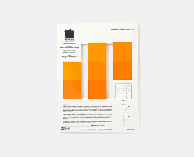 Color tolerance sets
Standard size: 8½" x 11"
Used to improve color quality control among buyers and suppliers, these are ideal for multi-component products manufactured in different geographic locations that need to come together with a uniform color.
- The Color Tolerance Set shows the target color surrounded by a range of acceptable variations or “limits” to the ideal target.
- The tolerance limits are all defined as being a Light, Dark, Red, Green, Blue or Yellow when compared to the target color.
- Choices of three to nine limits to suit customer needs.
Look into the future of color
The color landscape is constantly evolving. Our color trend books address the influences that will affect color in tomorrow’s world, and provide an overarching color viewpoint 6 - 24 months ahead of the season. Combining visual inspiration with supporting color themes, color palettes and suggested color harmonies, we provide an in-depth analysis of emerging color stories, explain why they are relevant now, and how they can be applied to your brand and products.
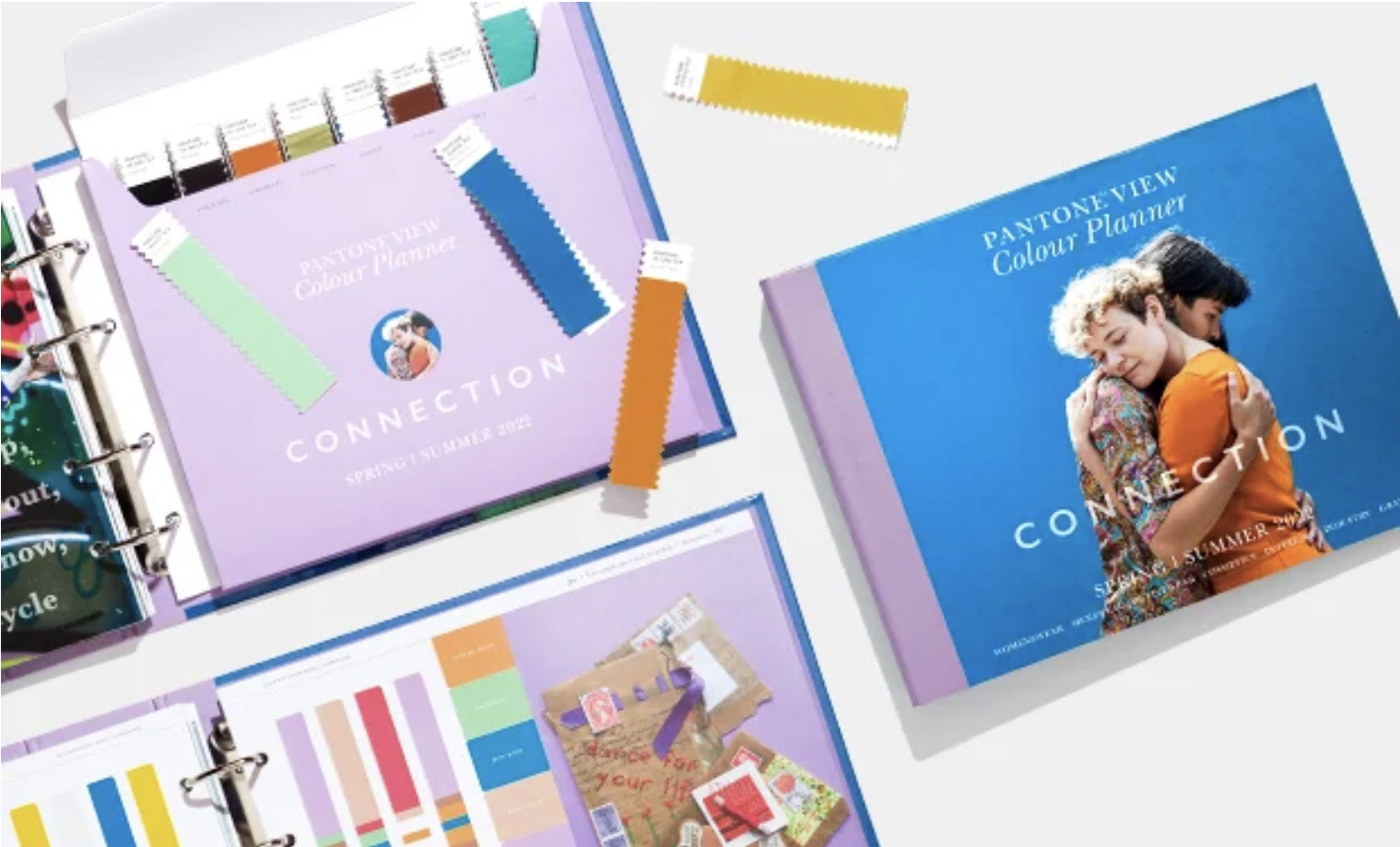 PANTONEVIEW Colour Planner
This semi-annual lifestyle forecast takes a macro look at global color and trend 24 months ahead of the season for mens, womens, active, color cosmetics, interiors, industrial and multi-media design.
Each forecast designates a seasonal theme emblematic of the macro trend.
Each individual color trend palette is supported by a trend story, aesthetically provocative visual inspiration, suggested color combinations, material and product application and surface and finish direction.
Packaged with 1” x 4” swatches of each of the forecasted shades
Includes a USB drive with digital content: static images, supported by themed movie with music, for use in creating internal story boards.
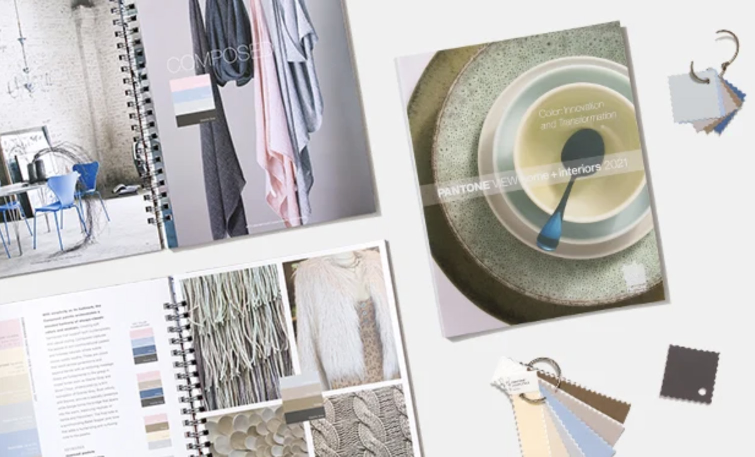
PANTONEVIEW Home + Interiors
This annual forecast provides focused color trend direction for home product and interior designers 15 months ahead.
Each forecast highlights an over-arching theme. Each color trend palette is supported by a trend story, culturally relevant visual inspiration, suggested color combinations, material and product application and surface and finish direction.
Highlights key material and finishes.
Provides a comprehensive overview by color family. Available on its own, with 1” x 4” swatches in each of the forecasted shades.
Includes digital content: static images, photos from individual trend palettes, for use in internal story boards.
VIEWPOINT Colour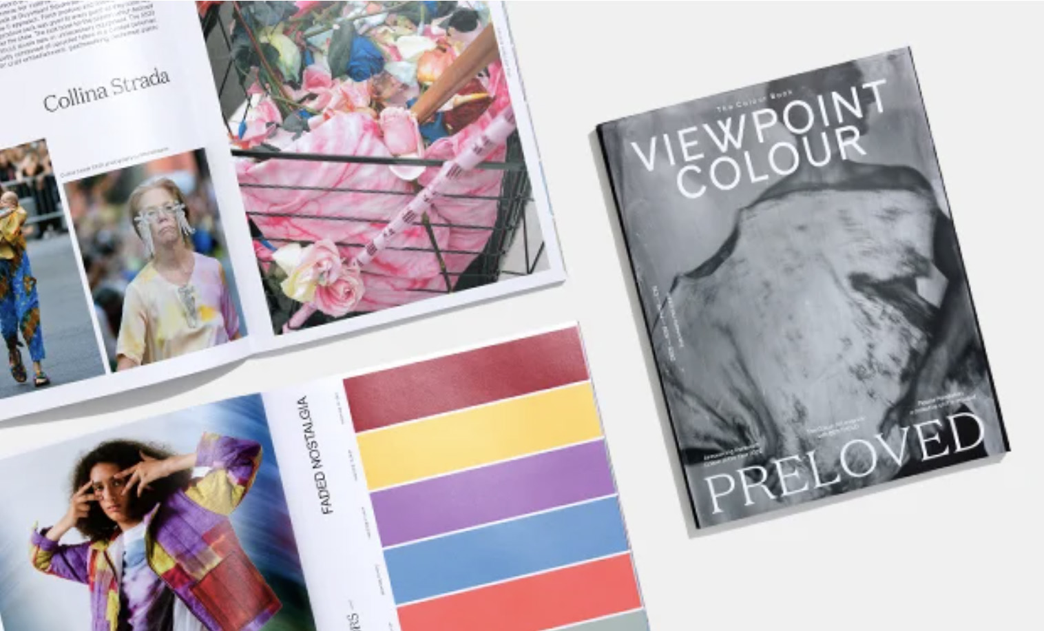
This unique, coffee table-style magazine is singularly devoted to color for design professionals worldwide, providing forward-thinking insight and design direction with a global perspective.
An ideal source of color trend direction and inspiration for graphics, fashion, and product designers.
Brand Partnerships + Case Studies
The Pantone Color Institute collaborates with prominent brands around the globe.
Learn more about our brand partnerships and case studies below:
 |
|
|
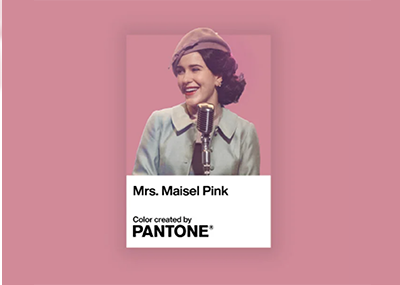
The Marvelous Mrs. Maisel x Pantone: Showcasing character evolution through custom color palettes Pantone Color Palettes illustrate the personal style journeys for Miriam “Midge” Maisel, Susie Myerson, Joel Maisel and Rose Weissman. |
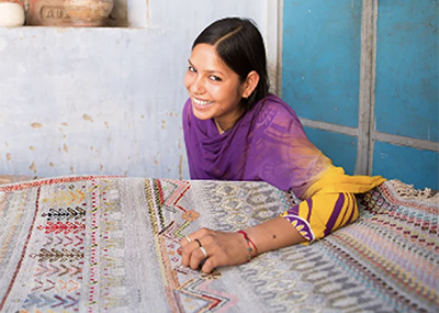
Jaipur Rugs x Pantone Connecting the local and global design community through the Power of FHI Paper Traveler.
|
 |
 |
|
Awakening the possibilities: Awakening interior design with Viva Magenta - Using Pantone’s Color of the Year to transform interior spaces.
|
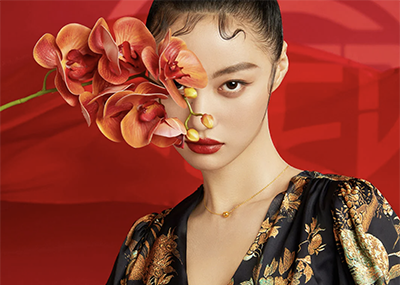
The color story of Chow Tai Fook: The new Chow Tai Fook color palette is a story of traditional color with a contemporary touch.
|
 |
 |
|
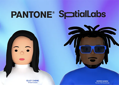
A Colorful Metaverse Color in the Metaverse – exploring the relationship of color between virtual and reality.
|
Creating a color palette reflecting the true colors of Finland A cornucopia of soothing color emblematic of this nordic utopia.
|
 |
 |
|
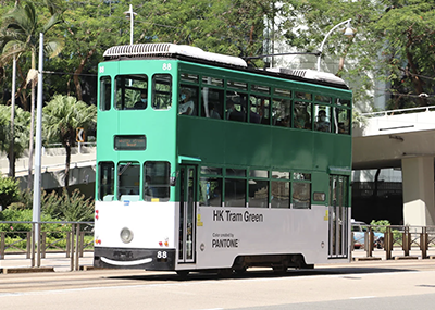
The Creation of HK Tram Green A signature green shade inspired by the iconic Hong Kong tram.
|
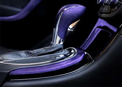
Creating chemistry for designers in plastic Pantone Color Institute and BASF Colors & Effects come together in a marriage of color, material and finish. |
 |
 |
|
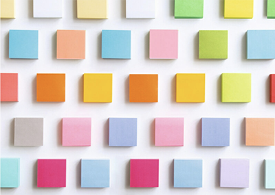
The art of ideation and color collide in the new Post-it® Note Collections collab with Pantone Color Institute Developed in partnership with the Pantone Color Institute, Post-it Brand will release 11 new collections of Post-it Notes with refreshed hues based on the power of color. Sparking creative productivity!
|
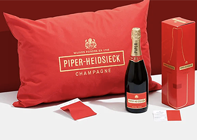
Pantone and Piper-Heidsieck define a red worthy of celebration The Piper-Heidsieck Champagne House was founded in 1785. The company has successfully grown internationally, and with that growth comes the challenge to ensure that the brand experience is consistent and coherent in all environments where Piper-Heidsieck champagnes are being displayed and enjoyed. |